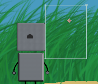
Walk Cycle:
One of the earlier works I did this year, this simple walk cycle was my first time making a humanoid character, so I had to use aspects such as joints and easing to make it look realistic. Additionally, I didn't use Photoshop to draw my character (the Pug Butler), but instead drew it on paper and scanned it in. I liked this project because it was my introduction to character animation, which is a field I'm interested in. As my first time, it wasn't perfect, though, as some of the motions I made to make the walk look realistic, such as the head bobbing and arms swaying, looked kind of unnatural in the end. In the future, I'll need to keep fine-tuning the movements to learn how to make it look smooth.
The Delivery:
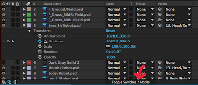
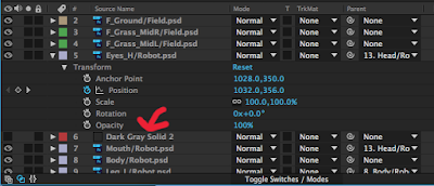
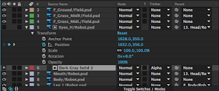
My first true story animation, The Delivery is currently the largest scale project I've made, taking many hours and lots of work to finish. It incorporated all I had learned in previous projects, including the walking from the project above, but I also learned much more, on my own and from others. Throughout my work, I ran into several situations where I needed to incorporate tools I didn't know (such as the Track Mattes I've posted about previously), so I just had to look up how to make it work, giving me more skills for future projects while making this one better. While this is definitely my best 2-D animation yet, improving all I had done in previous projects like the walk cycle, but still, I could've changed some things a bit to make it even better. After seeing peoples' reactions to it, I realized that I'm the only one that understood the story 100%, so adding small things, like music and sound effects, would likely add a lot to the atmosphere.
Hammer:
After I got used to working in the 3-D environment of Maya, the first complex model I made was this hammer. I learned many tools within Maya making this that I've used a lot since then. This was the first model I made where I had to move specific faces and vertices, which is a vital skill to have when designing anything that isn't as simple as a sphere or cube. I also used Bevels to make the rounded hammer head and the handle look more realistic. This was also the first time I used lighting on a real model, and I used a spotlight to really emphasize the hammer in the image. In this picture, I noticed that the shadows, as well as the edges of the spotlight are a bit rigid, but as I continued to work in Maya, my knowledge of "what does what" in the lighting has gotten better now.
Ice Cream:
This was the first true 3 dimensional animation I made, and for the first one, it turned out pretty smooth. To make it look like a true scene instead of just floating in a void, I made a set, with walls, a floor, and a table in a room. Besides some basics in the Castle project, this was the first time I used textures extensively, in the ice cream itself to give it bumps, but also in my own places, like the tile floor or the painting on the wall. I had to do a lot of experimenting with all the tools to get everything right, but it ended up working out fine. I also learned how to use the Outliner, which came in handy for grouping just the right shapes to rotate for the animation, making sure to include the 3-D texture boxes so the patterns on the ice cream didn't move. Really, I'm not sure what I would change in this project; I could zoom into the main rotating area, but then, the set I worked so hard on wouldn't be seen, so I'm fine with it as it is.
Pen:
 My most recent model at this time, this highlighter-pen was the first model I've made based off a real-world object. Being a cylindrical object, some parts of the pen were pretty difficult to make, while others were pretty easy. I spent a lot of time making sure the curves of the pen body were just like the real pen. I also made sure the cap was good, with the clip and especially where the solid plastic transitions to transparent. However, this transition, because it was partially transparent, wasn't straight on with the solid part, so it intersected, showing that it was't completely realistic. I'm pretty sure there's a way to take out the intersection, but I couldn't find it while I was modeling. Overall, though, did turn out pretty well, at least recognizable as my pen.


