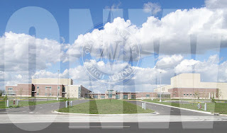
In my first project in Photoshop, I kind of learned how to use the basic tools of layering and opacity, and I figured out where everything was that was different than Illustrator. Some stuff was the same, though, and that made it easier to figure out what to do. The first big difference from Illustrator was that Photoshop is bitmap based, which I learned when zooming in to erase the white in the ONW compass.
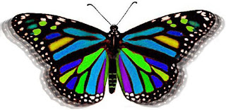
The second project was easier at first, but eventually got harder. Figuring how to select the parts required a bit of asking around, but I figured it out and made it even more precise by using the tolerance. Then, I changed the colors, which was easy after I figured out the shortcut. The hardest part was getting the flapping effect because I didn't know where to center the clone stamp, but I found the source panel and figured out how to make it exactly where I wanted.
Project three was similar to the first project, but I learned some more tools. The Text Mask was the first new thing I learned, which was a bit confusing to figure out. After getting that, I created a gradient around the text. Figuring out how to make a custom gradient with Raven Blue was the hardest thing because the panel was sort of hidden because it was set to a default of pure black.
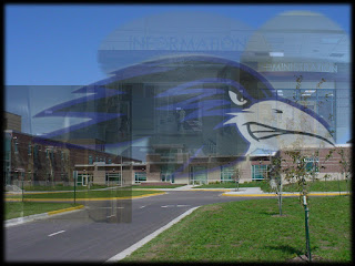
The last project was the most complex, and I learned what most people consider "Photoshopping", or removing stuff from pictures and adding things from other pictures. Editing out the car was especially cool. The magnetic lasso was probably the hardest thing in the class so far, because drawing around the raven's head was like one of those games where if you touch the edges of a maze, you get shocked. Eventually, I got it sort of good, so I continued on and finished the project.
 In my first project in Photoshop, I kind of learned how to use the basic tools of layering and opacity, and I figured out where everything was that was different than Illustrator. Some stuff was the same, though, and that made it easier to figure out what to do. The first big difference from Illustrator was that Photoshop is bitmap based, which I learned when zooming in to erase the white in the ONW compass.
 The second project was easier at first, but eventually got harder. Figuring how to select the parts required a bit of asking around, but I figured it out and made it even more precise by using the tolerance. Then, I changed the colors, which was easy after I figured out the shortcut. The hardest part was getting the flapping effect because I didn't know where to center the clone stamp, but I found the source panel and figured out how to make it exactly where I wanted.
 The last project was the most complex, and I learned what most people consider "Photoshopping", or removing stuff from pictures and adding things from other pictures. Editing out the car was especially cool. The magnetic lasso was probably the hardest thing in the class so far, because drawing around the raven's head was like one of those games where if you touch the edges of a maze, you get shocked. Eventually, I got it sort of good, so I continued on and finished the project.


